

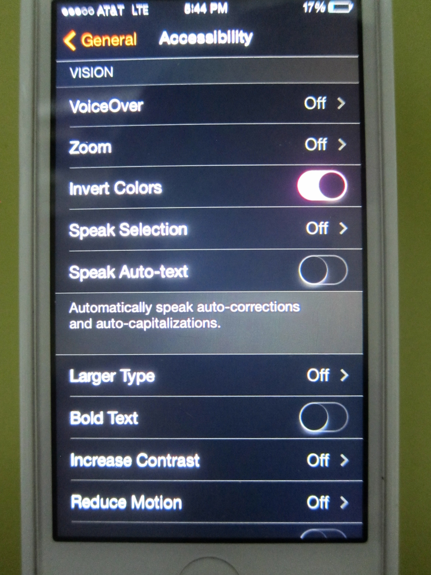
I spent a bit today playing with the Settings iOS7 as I know my mom is going to have some issues with the new UI aka the colors & contrast. In the Accessibility Settings there is a setting called Invert Colors that appeared to be the golden ticket but what I found was…well you will see.
At first, I was pretty excited as everything was pretty easy to read. Let’s go back into regular functions.
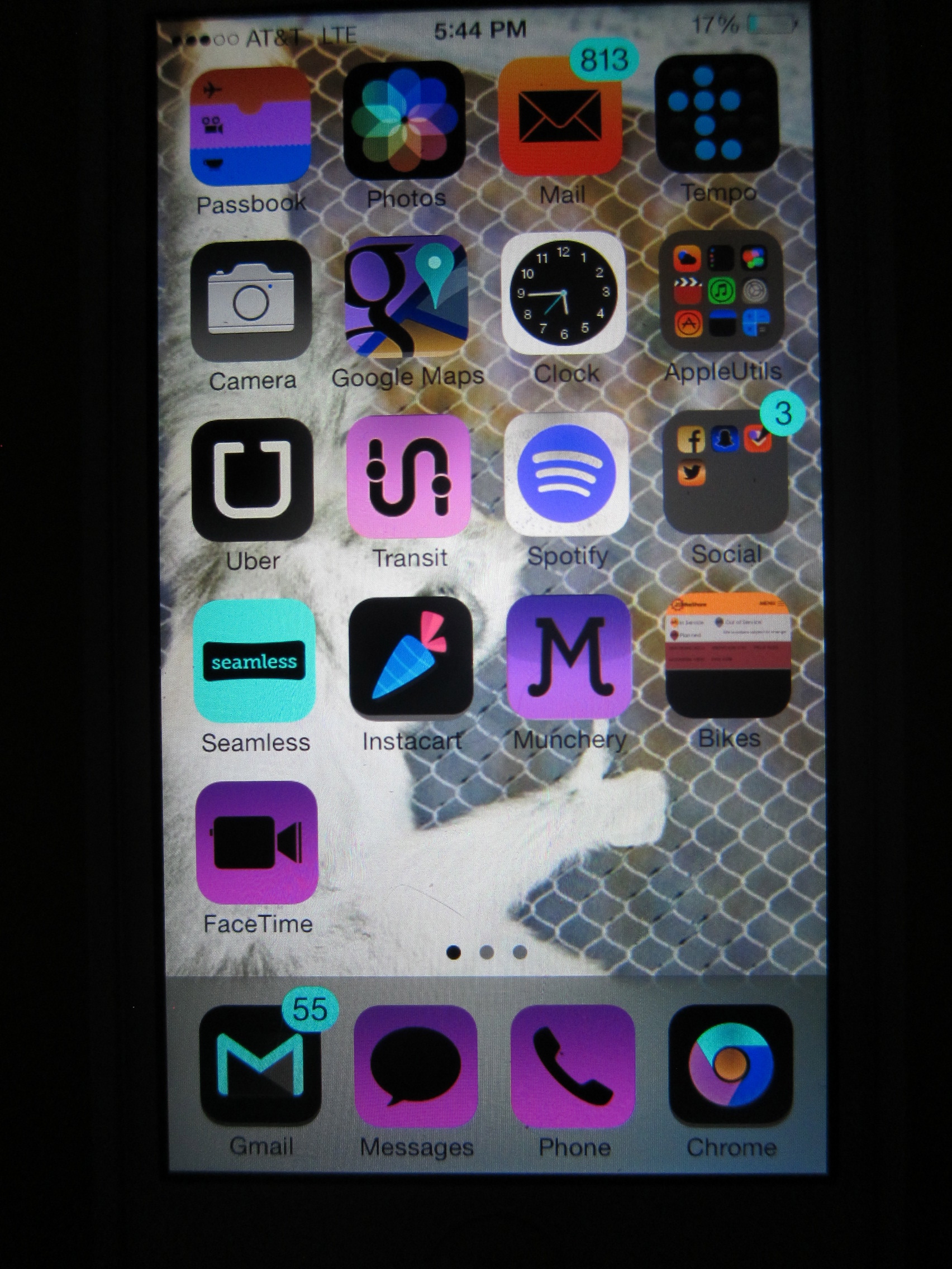
True to their words, the colors are inverted as you can tell with all my green icons being purplish now. Even my background image is inverted! I now have an albino monkey giving a thumbs up! I thought this was cool so went to text YKAT and attach a photo but then got this:

FAIL.
On a positive note, all your images return to normal when you turn off Invert Colors as it is just a display setting. I’d recommend changing to Bold Text or Large Type for now.
